Kroll Design System Microsite
Project overview
Project: Design System Microsite — centralized UX/design system portal with usage rules, component documentation, and live code examples for designers and developers
Role: Senior UX Designer — led product definition, IA, content design, component documentation structure, prototyping, usability testing, and engineering handoff
Timeline: 8–10 weeks (discovery → docs IA → prototype → content capture → launch)
Team: Design System Lead, Front-end Engineers, Design Ops, Content Strategist, Developer Advocates
Context Kroll’s product and engineering orgs required a single source of truth for UI components, patterns, tokens, accessibility rules, and working code snippets. Without a well-documented microsite, teams duplicated work, misused components, and faced inconsistent UI/UX across products. The microsite needed to serve both designers (usage rules, examples, design tokens) and developers (live code, npm/storybook links, integration notes).
Problem
No unified, discoverable documentation for components, tokens, and interaction patterns.
Designers and developers used inconsistent terminology and implementations, causing UI drift and higher maintenance cost.
New hires and cross-functional teams lacked an easy onboarding resource to learn component usage and engineering integration.
Lack of live examples slowed developer adoption and increased implementation errors.
Goals & success metrics
Create an authoritative, easy-to-navigate microsite that reduces design/dev friction
Increase component reuse by 40% within 6 months
Reduce design/dev questions/tickets about components by 50% within 3 months
Improve onboarding time for new designers/devs (target: 30% faster ramp)
Ensure accessibility and implementation parity via documented rules and live code
Approach
Stakeholder alignment
Workshops with Design Leads, Engineering Managers, Product Owners, and Design Ops to define scope, governance, and success metrics.
Content audit & inventory
Audited existing UI components, pattern libraries, tokens, and ad-hoc docs across repos and Sketch/Figma files.
Mapped gaps: missing usage guidance, inconsistent examples, absent accessibility notes.
User research
Interviews with 12 internal users (designers, frontend devs, QA, product managers) to surface needs, pain points, and common tasks.
Contextual observation of handoffs and dev implementation sessions.
Information architecture & content model
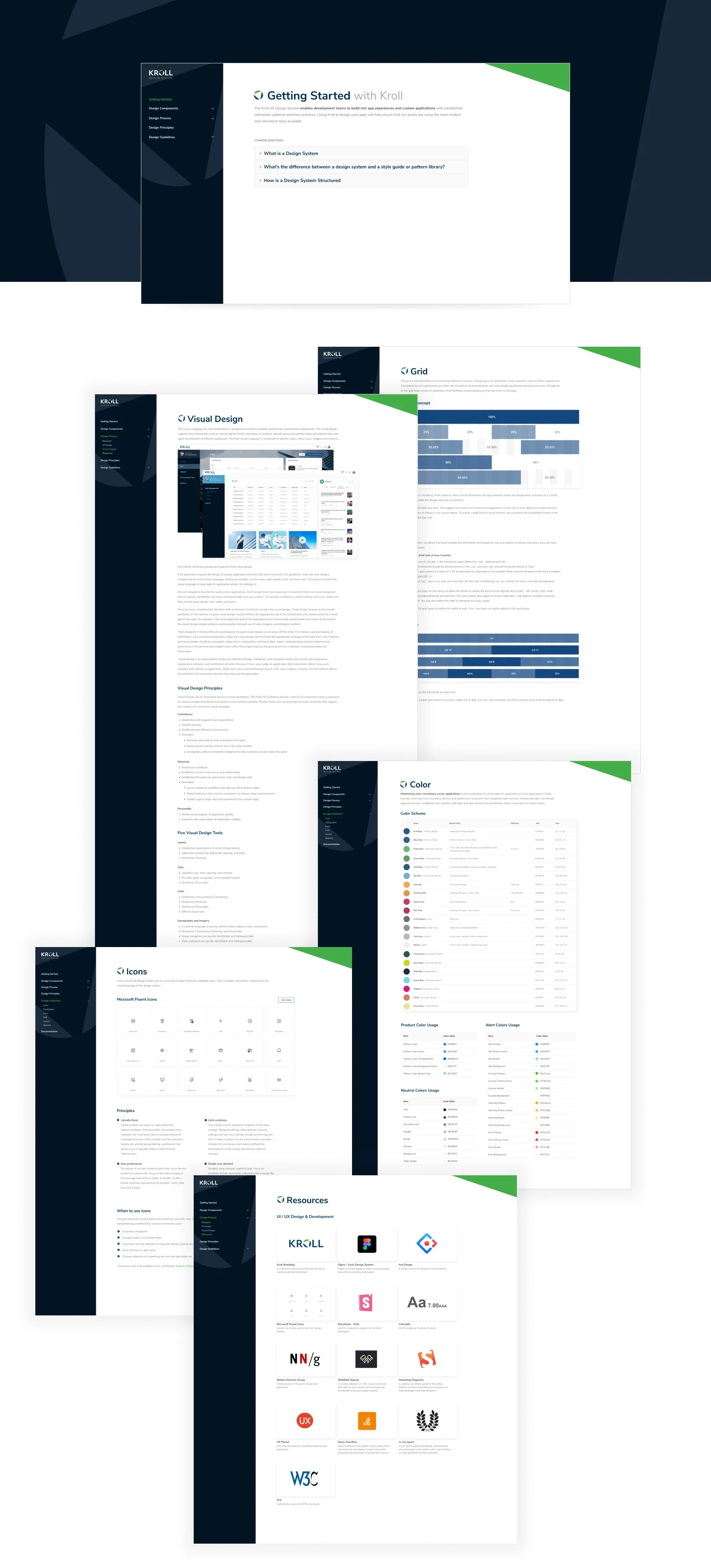
Designed IA: Home → Principles → Tokens → Foundations (colors, typography, spacing) → Components → Patterns → Accessibility → Guidelines → Getting Started → Live Code / Playgrounds → Governance.
Defined component doc schema: Overview, When to use, Anatomy, UX rules, Variants, Accessibility, Code snippet (React/HTML/CSS), Tokens used, Migration notes, Examples & demos, Changelog.
Prototyping & validation
Low- to high-fidelity prototypes of microsite nav and component pages; ran usability sessions with designers and engineers.
Built interactive live-code playgrounds (embedded Storybook / CodeSandbox) to validate developer workflows.
Implementation & launch
Coordinated with engineering to integrate Storybook, deployable static site (Docs site), CI flow for docs updates from PRs, and a governance process for updates.
UX Research — methods & findings
Methods: 12 interviews, 6 contextual observations, card-sorting for IA with cross-functional participants, prototype usability tests (10 participants).
Key findings:
Frequent questions were “Which variant should I use?” and “How do I implement X with accessibility?”
Developers wanted copy-paste-ready snippets and token references; designers wanted live examples and usage do/don’t visuals.
Card-sort validated a components-first IA with a separate tokens & foundations section favored by both designers and engineers.
Onboarding suffered without a clear “Getting Started” path and quick examples.
Design solutions
Clear IA with role-focused entry points: Designer View (rules, do/don’ts, tokens) and Developer View (live code, npm install, integration steps).
Component documentation template with a consistent schema and visual examples (do/don’t, states, responsive behavior).
Live code integration: embedded Storybook/CodeSandbox for each component with copyable snippets (React + plain HTML/CSS).
Tokens & foundations page: interactive token explorer showing color contrast, spacing scales, and typography scale with copyable token names.
Accessibility section: keyboard interactions, ARIA guidance, contrast checks, and automated accessibility audit notes for each component.
Governance & contribution guide: process for proposing changes, creating a ticket/PR, and review checklist (design + engineering + a11y).
Search & discoverability: global search for tokens/components and “most used” component quick-links.
Onboarding flow: “Getting Started” checklist, runbook for integrating the design system, and bite-sized tutorials for common tasks.
Analytics: Doc usage metrics, top pages, search queries, and most-copied code snippets to inform documentation improvements.
Measured outcomes (post-launch targets / early results)
Component reuse: +45% reuse in targeted pilot teams within 6 months
Support load: Component-related questions and implementation tickets dropped ~52% in the first 3 months in pilot teams
Onboarding: New designer/dev ramp-time reduced ~30% in pilot groups
Documentation engagement: avg session duration on component pages = 4–6 minutes; high copy-snippet rates from live code panes
Accessibility compliance: baseline a11y issues reduced for new implementations due to embedded guidance and audits
Deliverables
Information architecture and content model
High-fidelity microsite prototypes (desktop & mobile)
Component documentation template and populated docs for core components
Embedded Storybook/CodeSandbox integration and live code examples
Tokens explorer and accessibility checker prototypes
Governance & contribution playbook (PR/runbook)
Usability test report and prioritized documentation backlog
Analytics event map and dashboard for docs usage
Learnings & impact
Role-specific views and copy (Designer vs Developer) reduce cognitive load and speed task completion.
Embedded live code drastically increases developer adoption and reduces implementation errors.
Governance and a clear contribution path are essential to keep docs current and trustable.
Tracking which snippets are copied and which pages are visited highlights high-value docs to expand and low-value docs to retire.