Humanities Kansas
Project overview
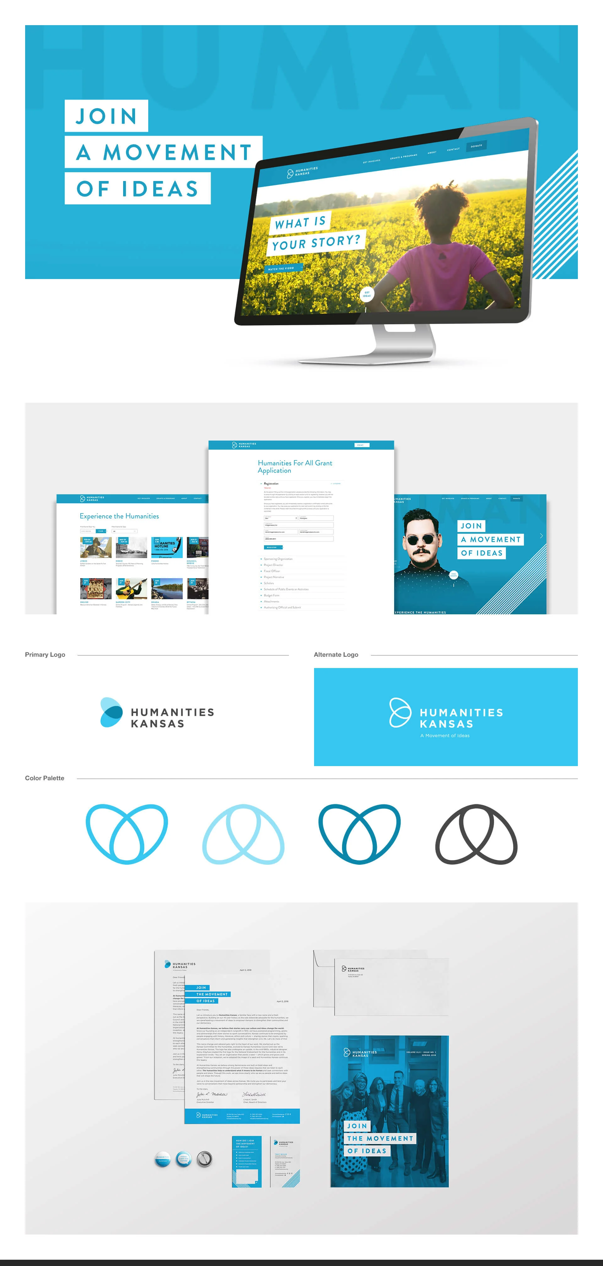
Project: Website and content experience — clarify “What are the Humanities?” messaging, increase public engagement, and drive program participation and donations
Role: Senior UX Designer — led strategy, content design, information architecture, UX writing, prototyping, usability testing, and handoff
Timeline: 8 weeks (discovery → content strategy → prototype → test → launch)
Team: Program directors, Content Strategist, Front-end Dev, Communications, Events & Fundraising, Analytics
Context Humanities Kansas champions public humanities—stories, history, literature, ethics and culture that connect people and place, generate ideas, and inspire civic action. The organization needed a clear, accessible web explanation of “What are the Humanities?” that educates broad audiences, drives event participation, supports educators, and encourages donations and volunteerism.
Problem
Abstract mission language made it hard for newcomers to understand practical relevance.
Multiple audiences (general public, educators, donors, civic leaders) required different explanations and actions.
Existing content was fragmented: stories, programs, and impact metrics were not unified into a compelling narrative path.
Conversion paths for events, grants, memberships, and donations were unclear.
Goals & success metrics
Create an approachable, memorable explanation of “What are the Humanities?” for general audiences
Increase time-on-page and engagement with program content (+35% target)
Improve conversions: event registrations (+25%), educator resource downloads (+30%), and donation starts (+20%)
Provide clear pathways for each audience to take action (attend, teach, fund, volunteer)
Research & insights
Methods: stakeholder interviews (program leads, educators, fundraising), user interviews with 18 participants (public, teachers, donors), content audit, and analytics review.
Key findings:
People connect to concrete stories and local examples rather than abstract definitions.
Audiences want quick, tangible outcomes: “How will this help my classroom?” or “How does this improve my community?”
Trust signals (impact stories, local partners, measurable outcomes) strongly influence donations and participation.
Educators need curated, standards-aligned resources and easy licensing/usage guidance.
Design approach
Audience-first IA
Primary audience hubs: Discover (general public), Teach (educators), Partner (civic organizations), Support (donors & volunteers).
Narrative-driven content
Lead with a plain-language “What are the Humanities?” explainer using story-first microcopy and three core pillars: Connect, Generate Ideas, Inspire Action.
Each pillar includes a short definition, an illustrative local story or case study, and a clear CTA (Attend, Use a Resource, Partner, Donate).
Story & impact templates
Modular story cards: headline, 2–3 sentence hook, impact metric, and “Read/Use/Join” CTA to encourage further exploration.
Educator resources
Curated resource library with search/filters (grade, subject, standards alignment), downloadable lesson kits, and licensing info.
Action funnels
Contextual CTAs on every page for relevant next steps: register for events, request a speaker, apply for a grant, donate.
Trust & metric visibility
Prominent impact metrics (people served, programs funded, local partners) and partner logos/testimonials to build credibility.
Accessibility & tone
Plain-language UX writing and accessible templates for screen readers; ensure content is inclusive and culturally sensitive.
Prototyping & testing
Built low- to high-fidelity prototypes for landing pages and educator resource flows.
Moderated usability tests with 12 participants (mix of audiences) to validate clarity of the “What are the Humanities?” explainer and action funnels.
Iterated microcopy, story lengths, and CTA placement based on comprehension and task success.
Design solutions
Hero explainer: three-line plain-language definition + “Explore how the humanities connect, generate ideas, and inspire action” with quick audience buttons.
Pillar pages: Connect / Generate Ideas / Inspire Action — each with 1–2 local stories, a visual impact stat, and direct CTAs.
Educator hub: filters, downloadable lesson kits, and a simple request form for classroom visits.
Events & grants pages: clear eligibility, impact examples, and streamlined application/registration flows.
Donor path: concise impact statements, example uses of funds, and friction-minimized donation form with suggested amounts and stories tied to each level.
Content governance: editorial templates and impact-data sync processes to keep stories and metrics current.
Measured / expected outcomes (targets)
Time-on-page for explainer + pillar pages: +35% target
Event registrations: +25% target via embedded CTAs and story-driven landing pages
Educator downloads: +30% target through curated resource hub
Donation starts: +20% target with story-linked donation CTAs
Reduced bounce on introductory pages and increased click-throughs to program pages
Deliverables
High-fidelity prototypes and copy-first templates (Figma)
Audience IA and content map (Discover / Teach / Partner / Support)
Story card templates and CMS publishing guide
Educator resource library design and filters
Usability test report with prioritized fixes
Analytics event map (story reads → resource download → event registration → donation)
Handoff package: component specs, accessibility checklist, and dev tickets
Learnings & impact
Story-first explanations anchored to local examples make abstract mission statements tangible and actionable.
Audience hubs reduce cognitive load and increase conversion by offering clear, relevant next steps.
Visible impact metrics and partner testimonials increase donor confidence and educator adoption.
Maintaining a simple editorial cadence and data sync ensures stories remain fresh and credible.