Junction City Community College
Project overview
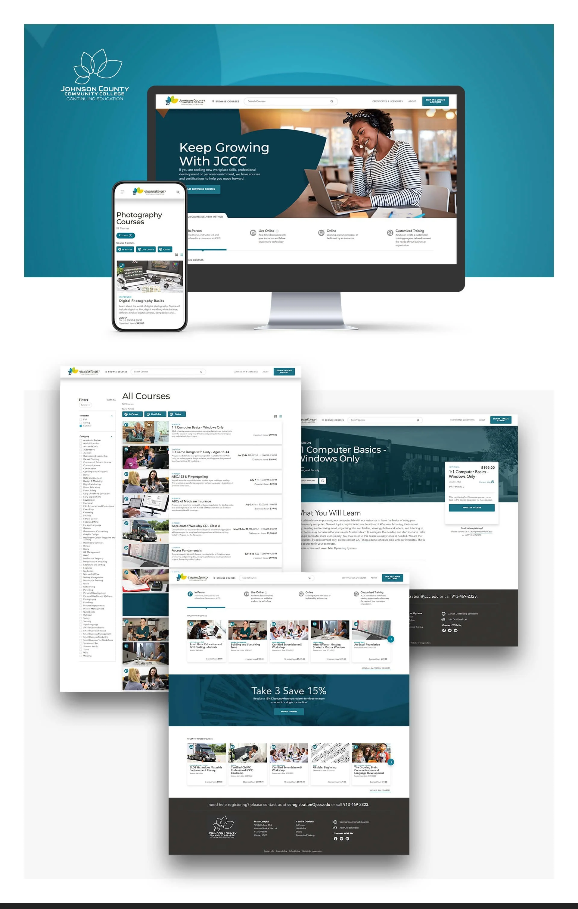
Project: Online class registration platform — end-to-end student registration, search, and admin workflows
Role: Senior UX Designer — led research, information architecture, interaction design, prototyping, usability testing, and handoff to engineering and registrar team
Timeline: 10 weeks (discovery → prototypes → usability testing → development handoff → launch)
Team: Product Owner (Registrar), IT Lead, Front-end Dev, Back-end Dev, QA, Enrollment Services, Content Strategist
Context Junction City Community College (JCCC) previously had no online registration system; students registered in person or by phone, creating long lines, high staff load, and missed enrollment opportunities. The college needed an accessible, easy-to-use online registration platform to serve new and returning students, streamline admin workflows, and improve enrollment conversion.
Problem
No online registration: students forced to call or visit campus, causing friction and missed enrollments.
Course discovery was difficult: students struggled to find classes by topic, schedule, or program.
Administrative burden: staff handled manual enrollments, corrections, and reconciliation across systems.
New student onboarding and repeat registrations were time-consuming and error-prone.
Goals & success metrics
Launch a reliable online registration platform within academic term timeline
Increase online registrations to 60%+ of total enrollments within 6 months
Reduce phone/in-person registration volume by 50% within 90 days
Cut admin processing time per enrollment by 40%
Improve first-time student completion of registration flow (goal completion rate) to 75%
My approach
Stakeholder alignment
Workshops with Registrar, Enrollment Services, Financial Aid, and IT to map requirements, compliance, and integration needs (Xenegrade/ SIS).
UX research
Contextual interviews with students (new, returning, working adults) and enrollment staff.
Shadowed front-desk registration and phone support during peak enrollment windows.
Audit of existing materials: course catalogs, PDFs, schedules, and manual admin workflows.
Synthesis & personas
Created 4 personas: New Student (first-time), Returning Student (part-time), Working Adult, Enrollment Admin — mapped goals and critical tasks.
Information architecture & flows
Designed search-first course discovery: free-text + filters (term, day/time, modality, credits, instructor).
Built clear course detail pages with seat availability, prerequisites, fees, and direct “Add to Cart / Register” action.
Designed student dashboard: in-progress enrollment, holds, financial summary, and required actions.
Admin workflows: sync events for SIS, manual sync fallback, analytics for 0-result searches and search popularity.
Prototyping & testing
Low → high-fidelity prototypes for desktop and mobile; moderated usability tests with students and admins.
Iterated on search behavior, cart-to-checkout flow, and error/hold resolution paths.
Handoff & implementation
Delivered design system snippets, interaction specs, accessibility notes, and an analytics event map for tracking funnel metrics and sync events.
UX Research — methods & findings Methods
Contextual interviews: 18 students across segments + 6 enrollment staff
Field observation: front-desk and phone registration during peak enrollment
Usability testing: 16 participants (desktop + mobile), task-based on prototypes
Analytics planning: event map for search, add-to-cart, checkout, holds, and SIS syncs
Key findings
Discovery friction: students used inconsistent terminology; synonyms and program names caused many 0-result searches.
Task drop-off: students abandoned registration when holds (financial, prerequisites) weren’t clearly explained or resolvable online.
Mobile-first need: many students attempted registration on phones; desktop-only flows increased abandonment.
Admin pain: manual syncs to SIS created delays; no emergency “hijack” workflow when SIS was down.
Trust & clarity: students needed clear next steps, deadlines, and fee visibility before completing checkout.
Design solutions
Search-first interface: tolerant search with synonyms and suggested corrections; filters for term, delivery mode, day/time, credits.
Course detail & quick-register: clear seat counts, prerequisites, fees, and “Register” CTA with inline hold checks.
Cart & checkout flow: progressive disclosure of holds, immediate guidance (how-to-resolve hold) and ability to proceed to waitlist where allowed.
Mobile-responsive UI: optimized for touch inputs and one-handed use; persistent CTA to resume registration from dashboard.
Admin sync & fallback workflows: automated SIS sync events plus manual-triggered sync and a “hijack” mode to queue registrations when SIS is unavailable.
Analytics & admin tools: dashboards for 0-result searches, search popularity, registration funnels, and reconciliation exports.
Measured outcomes (post-launch / pilot results)
Online registrations: reached 64% of enrollments within 6 months
Phone/in-person volume: reduced by 58% within 90 days
Admin processing time: reduced by 45% per enrollment through automated syncs and clearer self-service holds resolution
Registration completion (first-time flow): 78% goal completion rate in usability cohort improvements
Reduced 0-result searches by 70% after implementing search synonyms and suggestions
Time-to-register: average end-to-end registration time dropped from ~18 minutes (in-person/phone) to under 6 minutes online
Deliverables
High-fidelity desktop & mobile prototypes (Figma)
Personas and prioritized task matrix
IA and detailed user flows (search → course → register → checkout)
Admin sync & fallback workflow diagrams
Usability test report with prioritized fixes
Analytics event map and KPI dashboard (registrations, holds, searches)
Handoff package: component specs, accessibility checklist, and dev tickets
Learnings & impact
A search-first experience that handles synonyms and program language significantly improves discovery and reduces abandonment.
Explicit hold resolution steps and visibility reduce manual admin handling and speed student completion.
Supporting mobile-first flows is critical for community college populations.
Building fallback admin syncs (manual trigger/hijack) ensures continuity during SIS downtime and prevents enrollment loss.